
Tags
Financial Systemic Issues: Booms and Busts - Central Banking and Money - Corporate Governance - Cryptocurrencies - Government and Bureaucracy - Inflation - Long-term Economics - Risk and Uncertainty - Retirement Finance
Financial Markets: Banking - Banking Politics - Housing Finance - Municipal Finance - Sovereign Debt - Student Loans
Categories
Blogs - Books - Op-eds - Letters to the editor - Policy papers and research - Testimony to Congress - Podcasts - Event videos - Media quotes - Poetry
What’s next for U.S. housing finance?
Published by the R Street Institute.
The attached policy study originally was published in the Spring 2017 edition of Housing Finance International.
With the new administration of President Donald Trump, and simultaneous Republican majorities in both houses of the Congress, can the United States look forward to meaningful reform of Fannie Mae, Freddie Mac and American housing finance?
My view is that it is highly unlikely. The interested parties and the policy ideas are simply too fragmented for a politically energetic solution to emerge and be enacted. Many powerful interest groups are fond of the subsidies that Fannie and Freddie pass on to them from the taxpayers. At the same time, a dissonant chorus of well-intentioned theoreticians promote mutually inconsistent proposals.
The topic of the debates—the American housing finance sector—is genuinely huge, with $10.2 trillion in outstanding mortgage loans. That is a number about equal to the combined gross domestic products of Germany, France, the United Kingdom and Canada.
U.S. housing finance also has a troubled history. It collapsed in the 1980s, when based on the savings and loan model, and required a $150 billion taxpayer bailout. The bonds sold to finance that bailout won’t be paid in full for another 13 years from now – until 2030. The 1980s U.S. housing finance scandal led to abolition of the government’s housing finance promoter and regulator of the time, the Federal Home Loan Bank Board, in 1989. One of the lessons drawn by American financial regulators at that point was that housing finance needed to focus on the securitization of mortgages, a less-than-perfect conclusion.
So, the United States tried again, this time with a model that featured at its core securitization and the “government-sponsored enterprises” Fannie Mae and Freddie Mac. Fannie and Freddie rapidly expanded mortgage credit by issuing trillions of dollars in mortgage-backed securities and debt in highly leveraged balance sheets, which always depended on the so-called “implicit” guarantee of the U.S. government. That was a mistake, but they and the politicians who promoted them foolishly claimed that this model was “the envy of the world.” Both government-sponsored and private mortgage securitization inflated. The increase in outstanding mortgage loans was remarkable, as shown in Graph 1, and was accompanied by political cheering.

Total American mortgage loans reached $2 trillion in 1988. By 2006, during the golden years of Fannie and Freddie, they had quintupled to $10 trillion. Nominal GDP increased by 2.6 times during this period, so mortgage debt was growing far faster the economy for years, a clear danger sign in retrospect. There was an acceleration after 1998, when mortgages crossed $4 trillion. Today, after the fall, total mortgage loans are at about the same level as in 2006, having gone basically sideways for a decade. Graph 2 shifts to the long-term growth of total U.S. mortgage loans relative to the size of the economy, measured as a percent of GDP – and displays an instructive history.
In this graph, we see first the post-World War II U.S. mortgage credit boom, which ran until 1964. Then mortgages as a percent of GDP were flat at about 30 percent for 20 years. They rose to 45 percent in the 1980s-1990s, then took off with the great mortgage bubble, reaching 77 percent in 2007 as disaster loomed.

At that point, as we know, the American housing finance sector, with its post-1980s “improvements,” had an even bigger collapse than before, including the failure of Fannie and Freddie. Among the bailouts of the time was a $189 billion crisis equity infusion in the deeply insolvent Fannie and Freddie by the taxpayers. Fannie and Freddie thus became subsidiaries of the U.S. government. They remain so to this day, almost nine years after their humiliating failure.
Since the top of the bubble, total U.S. mortgages as a percent of GDP have fallen to 55 percent. This is sharply corrected from the peak, but is still a high level, historically speaking – equal to the proportion in 2002 and close to twice the level of 1964 or 1980.
Because of their government support, Fannie and Freddie remain powers in the American mortgage system. They guarantee or own $4.9 trillion of mortgage loans – or 48 percent of all the mortgage loans in the United States. They have combined $5.3 trillion in total assets and $5.3 trillion in liabilities. You will readily see by arithmetic that they have no net worth to speak of.
The Treasury Department controls 79.9 percent of the common stock of Fannie and Freddie. Why not 80 percent or 100 percent? Because that would have forced the government to put Fannie and Freddie’s $5 trillion of debt on the government’s books – an outcome the government was and is desperate to avoid. Honest accounting is not going to happen, and the Treasury will continue whatever gyrations it takes to keep its Fannie and Freddie exposure as an off-balance-sheet liability.
The Treasury Department also owns $189 billion of senior preferred stock in Fannie and Freddie, the bailout investment. This was the amount required to bring their net worth up to zero, where it remains. Although Fannie and Freddie are now reporting profits – a combined $20.1 billion for 2016 – virtually all of this is paid to the Treasury as dividends on the senior preferred stock, so there is no increase in their capital. The profits made by the government, at least for now, from owning these biggest companies in the mortgage business, and from absorbing half the country’s mortgage credit risk, thus go to help reduce the annual government deficit.
At Dec. 31, 2016, Fannie and Freddie’s combined net worth was about $11 billion, compared to their assets of $5.3 trillion. This gives them a risible capital ratio of 0.2 percent – so close to zero that the difference doesn’t matter.
Fannie and Freddie’s principal business is guaranteeing mortgages. So here is an essential question: What is the value of $5 trillion in guarantees from guarantors with zero capital? Clearly the answer is that such guarantees by themselves have no value. Every bit of the value and all ability of Fannie and Freddie to report a profit comes not from themselves, but from the fact that the government truly (though not formally) guarantees their $5.3 trillion in liabilities. In this sense, it certainly seems fair that the Treasury continue to take all the profits which its guarantee creates.
The government is also involved in directly financing Fannie and Freddie’s debt, for the U.S. central bank has in its investment portfolio the remarkable amount of $1.7 trillion of Fannie and Freddie’s mortgage-backed securities. Thus, the Federal Reserve owns and has monetized one-third of Fannie and Freddie’s liabilities and one-sixth of all the mortgages in the country. This is unorthodox central banking, to say the least. The Fed is still buying Fannie and Freddie’s MBS, eight years after the 2009 end of the crisis, as they make new investments to replace any maturity or prepayment of principal. The Fed’s interest-rate risk position is exactly like that of a 1980s savings and loan institution: long-term, fixed rate mortgages funded short. How will that turn out? One must wonder.
In the meantime, the Fed is reporting billions of dollars of short-term profits from investing in long-term fixed-rate mortgages and funding them with floating rate deposits. The bulk of this profit it then pays to the U.S. Treasury. The scheme reduces the government deficit in the short run by speculating in the interest rate risk of mortgages guaranteed by Fannie and Freddie and in turn guaranteed by the Treasury. The financial relationships of the Federal Reserve, the Treasury Department and Fannie and Freddie make an intriguing tangle. One plausible argument is that we should view them all together as one financial entity, the intertwined Treasury-Fed-Fannie-Freddie financial combine.
Viewed from the rest of the world, the American housing finance system is not only impressively big, but odd and indeed unique. The thing that makes it most odd continues to be the role and financial structure of Fannie and Freddie. In addition to their function of guaranteeing and massively concentrating mortgage credit risk, it is clear that they are entirely wards of the state and intertwined in a very complex fashion in the government’s finances.
What’s next for U.S. housing finance? Will Fannie and Freddie just continue forever as subsidiaries of the government? Nobody admits to liking the status quo very much. But the status quo has tremendous inertia and has proved highly resistant to change over the last eight years.
Do Fannie and Freddie as government subsidiaries represent a good model for American housing finance? For those (like me) who believe in competitive, private markets as the superior form of allocating resources and risk, the answer is obviously “no.” In particular, people like me think that reinstating anything like the former disastrous Fannie and Freddie “GSE” structure would be a monumental mistake. Many people do not want to see another government bailout of a Fannie and Freddie that have eternally zero capital. Many others correctly think that private capital should bear the principal credit risk in the mortgage market. Speculators who have bought the 20.1 percent of Fannie and Freddie’s common stock that the government does not control, or who own the old, junior preferred stock whose noncumulative dividends have not been paid for years, hope for some political event that will generate windfall gains for them.
All these people would like change, but there is no consensus proposal. Moreover, many other interests wouldn’t mind seeing the old Fannie and Freddie come back, or even the current Fannie and Freddie continue.
For example, homebuilders like having the government guarantee mortgages so it’s easier to sell houses, including bigger and more expensive houses. Realtors like anything that helps sell houses faster and increases their commissions. Investment banks find it easier and more profitable to sell mortgage-backed securities around the world when they are guaranteed by the U.S. government. Then they can be marketed as so-called “rate products,” where the investors don’t have to worry about credit risk. In addition, these firms can then more make money selling swaps and options to hedge the interest rate risk of Fannie and Freddie MBS. Affordable housing groups like the subsidies that Fannie and Freddie used to pass out so freely, as do left-leaning politicians looking for ways to get money for their constituents without facing a vote in Congress.
For several years after the most recent housing crisis, it seemed that Fannie and Freddie’s egregious failure, and their embarrassing bailout, would surely trigger some kind of fundamental reform. But it didn’t. Bills were introduced in Congress, but didn’t pass. Many plans for how to reform American housing finance in general and Fannie and Freddie in particular were published, and some of them widely circulated and debated, but years went by and nothing happened.
The Trump administration would clearly have different ideas for housing finance reform than its predecessor, but in its early months, it has not so far articulated any specific recommendations. The new secretary of the Treasury, Steven Mnuchin, has previously said that continuing government ownership of Fannie and Freddie is unacceptable, but has not yet provided any proposed path to change it.
In my opinion, no legislative reform proposals, whether from the new administration or elsewhere, have a high probability of success in any near term. But there is one possibility we should consider as the one that makes the most sense.
This requires admitting that we cannot get rid of Fannie and Freddie, and that we cannot stop the government from making them “too big to fail” whenever they next get themselves in trouble. However, we should in the meantime take away all the special government favors and sponsorship that allowed Fannie and Freddie to so distort the gigantic American housing finance market.
I propose that Fannie and Freddie should be treated in exactly the same way as every other trillion-dollar bank—that is, exactly the same as Citigroup, JPMorgan Chase, Bank of America, Well Fargo and the like. They should have the same capital requirements—with a minimum of 5 percent equity capital to total assets. They should make equivalent payments to the government for their taxpayer credit support, just as the banks do for deposit insurance. They should lose their indefensible exemption from state and local corporate income taxes. They should be clearly designated as the “systemically important” institutions they so obviously are and be regulated just like the other big banks under the forceful hand of the Federal Reserve.
Life under these terms would be harder for Fannie and Freddie than just living on the free guarantee from the taxpayers as a subsidiary of the government. But the American housing finance sector would be healthier, more based on private capital and less prone to entering yet another collapse.
Is this scenario possible? Yes. Is it likely? No.
Murphy’s Law and a banking career
Published by the R Street Institute.
Murphy’s law is well-known in the form: “Whatever can go wrong, will go wrong” and similar variations on the theme. But the intellectually interesting substance of Murphy’s law is: “Whatever can go wrong, will go wrong, given enough time.”
When a financial calamity has a very small probability of occurring—let’s say a 1 percent chance that it will and 99 percent that it won’t in any given year—we tend not, as a practical matter, to worry about it much. In most years, nothing will happen, and when it hasn’t happened for a long time, we may even start to treat the risk as essentially zero. Professors Jack Guttentag and Richard Herring authored a classic paper that gave this tendency the provocative name “disaster myopia.”
Banking and finance are full of events with a very small expected probability, but which are very costly when they do happen – e.g., a financial crisis.
Suppose the chance of a financial crisis is 1 percent annually. Suppose you optimistically start your banking career at the age of 23 and work to age 68, by which time you will be seasoned and cynical. That will be 45 years. Because you have given it enough time, the probability that you will experience at least one crisis during your career grows from that 1 percent in your trainee year to a pretty big number: 36 percent.
We observe in the real world that financial crises occur pretty frequently—every decade or two—and that there are a lot of different countries where a financial crisis can start. We also observe that virtually no one—not central bankers, regulators, bankers, economists, stock brokers or anybody else—is good at predicting the financial future successfully. Do we really believe the risk management and credit screens of banks, regulators and central banks are as efficient enough to screen down to a 1 percent probability? I don’t.
Suppose instead that the probability of the banking crisis is 2 percent, with 98 percent probability that it won’t happen in a given year. Are banks even that good? How about 5 percent, with a 95 percent probability of not happening? That would still feel pretty safe. One more dubious of the risk-management skills of bankers, regulators and the rest might guess the probability, in reality, is more like 10 percent, rather than 1 percent. Even then, in most years, nothing will happen.
How does our banker fare over 45 years with these alternate probabilities? At 2 percent chance per-year, over 45 years, there is a 60 percent probability he will experience at least one crisis. At 5 percent, the probability becomes 90 percent of at least one crisis, with a 67 percent chance to see two or more. If it’s 10 percent, then over 45 years, the probability of experiencing at least one crisis is 99 percent, and the probability of experiencing at least two is 95 percent. Since we learn from troubles and failures, banking looks like it furnishes the probability of an educational career.
In the last 45 years, there have been financial crises in the 1970s, 1980s, 1990s and 2000s. In the 2010s, we have so far had a big sovereign default in Greece, set the record for a municipal insolvency with the City of Detroit, and then broke that record with the insolvency of Puerto Rico. And the decade is not over. All of these crises by decade have been included in my own career around banking systems, of now close to 48 often-eventful years. The first one—the Penn Central Railroad bankruptcy and the ensuing panic in the commercial paper market—occurred when I was a trainee.
Since 1982, on average, a little less than 1 percent of U.S. financial institutions failed per year, but in the aggregate, there were 3,464 failures. Failures are lumped together in crisis periods, while some periods are calm. There were zero failures in the years 2005-2006, just as the housing bubble was at its peak and the risks were at their maximum, and very few failures in 2003-2004, as the bubble dangerously inflated. Of course, every failure in any period was a crisis from the point of view of the careers of then-active managers and employees.
A further consideration is that the probability of a crisis does not stay the same over long periods—especially if there has not been a crisis for some time. As Guttentag and Herring pointed out, risks may come to be treated as if they were zero, which makes them increase a lot. The behavior induced by the years in which nothing happens makes the chance that something bad will happen go up. In a more complex calculation than ours, the probability of the event would rise over each period it doesn’t occur, thanks to human behavior.
But we don’t need that further complexity to see that, even with quite small and unchanging odds of crises, given enough time across a career, the probability that our banker will have one or more intense learning experiences is very high, just as Mr. Murphy suggests.
Pollock before Oversight Subcommittee
Here’s more from R Street Distinguished Senior Fellow Alex Pollock’s testimony before the House Committee on Financial Services on the arbitrary and inconsistent non-bank SIFI designation process.
A flawed process generated by a flawed structure
Published by the R Street Institute.
Testimony to the Subcommittee on Oversight and Investigations
U.S. House Committee on Financial Services
Madam Chairman, Ranking Member Green and members of the Subcommittee, thank you for the opportunity to be here today. I am Alex Pollock, a senior fellow at the R Street Institute, and these are my personal views. I spent 35 years in banking, including 12 years as president and CEO of the Federal Home Loan Bank of Chicago, and then 11 years as a fellow of the American Enterprise Institute, before joining R Street last year. I have both experienced and studied numerous financial crises and financial cycles, including the political contributions to their creation and the political reactions afterward, and my work includes the issues of banking systems, central banking, risk and uncertainty in finance, housing finance and government-sponsored credit, and extensive study of financial history.
To begin, let me compliment the committee staff for their detailed, specific paper on the FSOC’s non-bank designation process. The paper embodies a very good analytical idea: it “compares the FSOC’s evaluation memoranda [of various companies] against one another to measure the consistency of the FSOC’s analysis.” This comparison, as documented in the paper, results in the conclusions that the treatment of different companies is not consistent, that FSOC did not follow its own formal guidance, and in summary, that the evaluations upon which companies either were or were not designated as systemically risky (as “SIFIs”) “have been characterized by multiple inconsistencies and anomalies on key issues.”
The paper says that “These examples cast doubt on the fairness of the FSOC’s designation process.” They do, but in my opinion, the more important point than fairness, is that the observations cast doubt on the objectivity of the FSOC’s work. Were these evaluations impartial analyses looking for disinterested conclusions, or were they rationalizations for conclusions already reached in political fashion?
As we all know, U.S. District Judge Rosemary Collyer, in her decision on the lawsuit MetLife brought against FSOC, found for MetLife and ruled that FSOC’s action was “arbitrary and capricious.” I want to focus on one of the reasons stressed by the judge: the assumptions FSOC made to arrive at its proposed designation.
Considering hypothetical losses resulting from MetLife, Judge Collyer’s Opinion pointedly observes that: “FSOC assumed that any such losses would affect the market in a manner that ‘would be sufficiently severe to inflict significant damage on the broader economy.’ …These kinds of assumptions pervade the analysis; every possible effect of MetLife’s imminent insolvency was summarily deemed grave enough to damage the economy.” [italics mine]
But the judge continued: “FSOC never projected what the losses would be, which financial institutions would have to actively manage their balance sheets, or how the market would destabilize as a result.” [original italics]
Further, “FSOC was content…to stop short of projecting what could actually happen if MetLife were to suffer material financial distress.” FSOC’s work appears pretty pathetic in this light, doesn’t it? FSOC “hardly adhered to any standard when it came to assessing MetLife’s threat to U.S. financial stability,” the judge found.
This sound and sensible judicial decision was appealed by the previous administration. I believe the current Treasury Department should immediately request the Department of Justice to withdraw the appeal, and that Justice should do so as soon as possible.
Recall that the point of designation of insurance companies as SIFIs is to give significant regulatory jurisdiction over them to the Federal Reserve Board, an institution with little or no experience in insurance regulation and which certainly cannot be considered expert in it. The Independent Member of FSOC Having Insurance Expertise, Roy Woodall, who indubitably is a true expert in the insurance business and its regulation, voted against the SIFI designation of MetLife. Coming again to FSOC’s assumptions, he objected: “The analysis relies on implausible, contrived scenarios” [my italics], which moreover, include “failures to appreciate fundamental aspects of insurance and annuity products.”
Mr. Woodall continued that “the central foundation for this designation” is the assumption of “a sudden and unforeseen insolvency of unprecedented scale [and] of unexplained causation.” He reasonably added, “I simply cannot agree with such a premise.” Can anybody?
Voting against the earlier designation of Prudential Financial as a SIFI, Mr. Woodall similarly pointed out that “Key aspects of [FSOC’s] analysis are not supported by the record or actual experience,” that it presumes “an unfathomable and inexplicable simultaneous insolvency and liquidation of all insurance companies” among its “misplaced assumptions.”
Ed DeMarco, a distinguished financial regulator who was at the time the acting director of the Federal Housing Finance Agency and thus the conservator of Fannie Mae and Freddie Mac, joined the dissent on Prudential and also observed the lack of evidence presented in the FSOC’s evaluation. FSOC proceeded “despite the acknowledgment that no institution has as disproportionally large exposure to Prudential”; it “does not fully take account of the stability of Prudential’s liabilities”; it assumes that “withdrawals at Prudential could lead to runs at other insurance companies without providing supporting evidence.” Once again, FSOC was operating on assumptions.
Of course, Messrs. Woodall and DeMarco were in the minority. But did the majority address their serious and substantial objections? Was there a meaningful, substantive exchange among FSOC members about the conceptual issues and the relevant evidence, as would be appropriate, before voting the proposal in? I am told that there was not.
Why not? The whole point of the existence of FSOC is supposed to be the combined substantive deliberation and development of insights by this committee of the heads of financial regulatory agencies. But it doesn’t seem to happen. So the designation process does not work well not only at the staff level, but also at the level of the FSOC as a corporate body.
I directly asked one former senior FSOC insider from the previous administration if the meetings of FSOC members had ever provided a new insight into financial issues. After thinking a moment, he gave me a candid answer: “No.”
Why is this? The Milken Institute, in a recent paper, proposed idealistically that although FSOC is currently nothing like this, “policy makers should convert the FSOC into a truly cooperative working group of regulators focused on risks.” To anyone familiar with the ways of Washington, this will seem an unlikely outcome.
The underlying problem, it seems to me, is the structure of FSOC itself. The shortcomings of the designation process reflect the underlying problems with the fundamental design. To begin with, FSOC is primarily a group of individuals each representing a regulatory agency, with turf to protect from intrusions by the others, and a regulatory record to defend from criticism, as principal bureaucratic concerns.
It is a big group, with 15 official members, but in addition, they all bring along helpers and allies. At the FSOC meeting of Dec. 18, 2014—which approved the MetLife SIFI designation—there were, according to its minutes, 46 people present. It’s pretty hard, indeed impossible, to imagine a real, open, give-and-take and “truly cooperative” discussion with 46 people.
Moreover, FSOC is chaired by the secretary of the Treasury, a necessarily very political, powerful senior government actor with major partisan and institutional interests always in play. No company can be taken up for systemic risk study by the SIFI staff without the approval of the secretary. Does this suggest a disinterested analytical process?
The Federal Reserve is a special case in the structural design of FSOC, because it stands to expand its power every time FSOC makes a SIFI designation. Does the Federal Reserve like power? Would it like to acquire a big new jurisdiction? Of course, and it is a party at interest in every SIFI discussion. I think it is not unreasonable to suggest that, given the Fed’s major conflict of interest, it should recuse itself from any SIFI votes.
With this context, it is easier to see why the FSOC’s SIFI evaluations had to rely on big assumptions and tended to make inconsistent analyses of different companies. It was because the decisions being made were inherently judgmental, with inherently subjective elements, made amid competing interests—that is to say, unavoidably political.
The shortcomings of the FSOC evaluations appear at least consistent with the theory that the evaluations were meant to rationalize decisions already made. Where might the pressure for such decisions have come from?
One publicly debated possibility is that commitments were already made in the setting of the international Financial Stability Board, in which two of the FSOC members, it is sometimes suspected, made deals with foreign central bankers and regulators about which companies were “global systemically important insurers.” There is dispute about whether the FSB discussions were really agreements, and whether they were thought to be binding. But there is no dispute that the international discussions and the naming of “Global SIIs” preceded the Prudential and MetLife designations of the FSOC. Roy Woodall reflected: “While the FSB’s action should have no influence, I have come to be concerned that the international and domestic processes may not be entirely separate.” A related question is whether the Treasury and Federal Reserve FSOC members felt personally committed by their international discussions. If they did, it seems that they should have disclosed that and recused themselves from the FSOC decisions. Did they feel committed to follow the FSB? Only they know.
During their research for the study of the FSOC designations process, the committee staff asked the FSOC’s executive director, Patrick Pinschmidt, what “significant damage on the broader economy” meant, in their assessments. Mr. Pinschmidt replied: “It’s up to each voting member of the council to decide for him or herself what constitutes a significant threshold.” That sounds like depending on subjective judgments to me.
I agree that it is a naturally good idea for financial regulatory agencies to get together and share information, ideas and experiences (to the extent that they will really share). But what is a committee of heads of regulatory agencies, who are acting as individuals and not even on behalf of the relevant boards or commissions, doing making political decisions? If Congress wants to have the Federal Reserve Board regulate big insurance companies, it can make it so in statute, using whatever subjective judgments it wants. In my view, FSOC is a distinctly inappropriate body to act as a little legislature.
The staff paper of FSOC’s evaluations of possible SIFIs, those recommended for designation and those not, details the inconsistencies in treatment. But these differences pale beside the huge discrepancy of those companies chosen for evaluation and those companies not evaluated at all, because the previous Treasury Secretary did not approve their being studied. The FSOC staff did not even analyze them, because of some higher, prior, political judgment. I think this could fairly be characterized as desperately wanting to “see no evil” when it comes to the systemic financial risk of some entities.
The most egregious cases are Fannie Mae and Freddie Mac, which are obviously systemically important and without question systemically very risky. To document that is simple, starting with their combined $5 trillion in credit risk, virtually zero capital and ubiquitous interconnectedness throughout the country and world. Two of the biggest causes of systemic risk are leveraged real estate and the moral hazard created by the government—Fannie and Freddie are both of these combined and to the max.
The Dodd-Frank Act gives a key assignment to FSOC: “To promote market discipline, by eliminating expectations on the part of shareholders, creditors, and counterparties that the Government will shield them from losses in the event of failure.” Fannie and Freddie are pure cases of the government shielding creditors and counterparties from losses, not only as a hypothetical, but as a vast fact. They operate entirely on the government’s credit. They represent the very essence of the problem that FSOC was supposedly created to address. But FSOC doesn’t even study them—instead, the staff was ordered not to study them.
That is an inconsistency raised to the nth power – in my view, a bankruptcy of FSOC’s intellectual credibility as run by the previous administration.
A recent article claims that “the next financial crisis that rocks America…will be driven by pension funds that cannot pay what they promised.” Whether or not it triggers the next crisis, there is no doubt that this is a looming huge risk.
In the very center of this risk is an insurance company absent from FSOC’s evaluation as a SIFI: the Pension Benefit Guaranty Corp. The PBGC is not only on the hook as guarantor of unpayable pensions nationwide, but is already insolvent itself with, according to its own books, a deficit net worth of $76 billion. Might PBGC represent a systemic risk? Yes. Do the creditors of the PBGC think “the Government will shield them from losses”? Yes. Does the FSOC staff evaluate the PBGC? Nope.
In sum, it appears that the flawed process of FSOC’s SIFI designations is generated by the flawed structure of FSOC itself.
In my opinion, structural reform of FSOC is needed as part of larger the Dodd-Frank reform legislation. But here are a few recommendations for improvements which could be implemented by the new administration in the short run:
FSOC should have regular meetings of principals only with substantive discussions of major issues and explorations of disagreements. No helpers, no staff.
The secretary of the Treasury should immediately instruct the FSOC staff to undertake systemic risk evaluations of Fannie Mae and Freddie Mac.
The secretary of the Treasury should immediately instruct the FSOC staff to undertake a systemic risk evaluation of the Pension Benefit Guarantee Corporation.
The Treasury Department should immediately request the Department of Justice to withdraw the government’s appeal in the MetLife v. FSOC suit and the Department of Justice should immediately do so.
FSOC staff should be encouraged to come up with new ideas on evolving risks for discussion among the FSOC principals.
Any SIFI evaluation should strictly follow the rules and guidance approved by FSOC, with analysis performed in a strictly consistent manner.
Assumptions about macro reactions and assumptions of implausible and contrived scenarios should be clearly identified as judgments and guesses.
International discussions and actual decisions of FSOC should be kept strictly separate. Any international agreements, even if informal, made by FSOC members, should be fully disclosed.
Again, my appreciation to the committee staff for their productive study of the inconsistent FSOC designation process and the very important issues it raises.
And thank you very much for the chance to share these views.
Barron’s LTE (Copy)
Published in Barron’s.
In asking “Is the Federal Reserve Using Overheated Data?” (Up & Down Wall Street, March 11), Randall W. Forsyth did the math: “If the Fed fulfills its own expectations of three [interest rate] hikes this year, it would put its target at 1.25 percent to 1.5 percent.” Let’s call it 1.5 percent at the end of this year. That is still a very low and substantially negative real interest rate. Against the Fed’s own goal of perpetual inflation at 2 percent a year, it is a real rate of negative 0.5 percent. Against the 2.5 percent increase in the consumer price index year over year through January 2017, it is a negative 1 percent real rate.
Although negative real interest rates during a crisis are usual, continuing them for nine years after the crisis ended, as it will be a year from now, serves powerfully to distort asset prices and rob savers.
U.S. banks’ real estate boom could be signaling next crisis
Published in Inside Sources.
Excessive real estate credit is the most common cause of banking booms, busts and collapses, throughout history, right up through the most recent financial crisis and around the world.
The U.S. commercial banking system has gotten much bigger relative to the U.S. economy than it used to be, although there are many fewer banks. The principal source of this growth is that banks have vastly increased their real estate exposure relative to the U.S. economy as a whole. This acceleration in real estate risk has fundamentally changed the nature of the banking system and its systemic risk.
Looking back to 1960, there were in the United States: 13,126 commercial banks and 18,962 depository institutions. By the end of 2016, depositories totaled only 5,913, of which 5,113 were commercial banks. That’s a 69 percent reduction in the number of depository institutions, and a 61 percent reduction in commercial banks.
On the other hand, in 1960, the total assets of the commercial banking system were only $256 billion. Though hard to believe, the entire banking system had total assets of only about one-tenth of today’s JPMorgan-Chase, and only 1.6 percent of today’s banking assets of $15.6 trillion. Citibank — which wasn’t Citibank then, but the dignified First National City Bank of New York — had less than $9 billion in assets. To our minds, now muddled by decades of constant inflation — including a central bank that has formally committed itself to creating perpetual inflation — these all seem like very small numbers.
Instead of measuring in nominal dollars, to see through the fog of long years of inflation, we can measure banking assets consistently relative to the size of the economy, as a percent of annual gross domestic product. The $256 billion of commercial banking assets in 1960 was 47 percent of the $541 billion in GDP.
The increase is striking: by 2016, banking assets had gone from 47 percent to 83 percent of GDP. That is more than a 75 percent increase in the banking system’s size relative to the economy, at the same time the number of banks fell by more than 60 percent. At present, this ratio is close to its all-time bubble peak.
What is driving this growth? It’s not commercial and industrial loans. On the trend, their percent of GDP is flat at 8 percent to 10 percent since 1960. On average, the commercial and industrial loans of the banking system have kept up with the growth of the economy, but not more.
The real driving factor is real estate credit. The commercial banking system’s real estate loans rose relentlessly from 5 percent of GDP in 1960, to more than 26 percent at their bubble peak, and are now at 22.5 percent.
Nor is this the whole real estate story. With the popularization of mortgage securitization, the banking system’s securities portfolio, not only its loan portfolio, shifted to real estate risk. Going back to 1992, the sum of banks’ real estate loans and mortgage-backed securities as a percent of GDP has risen to 32 percent — six times the 1960 level.
In short, the vast bulk of the dramatic increase in the size of the banking system relative to the economy comes from the acceleration of real estate exposure — a rising trend for more than six decades. How can the banks keep doing this? Well, it helps to have your liabilities guaranteed by the government, both explicitly through deposit insurance and implicitly through bailouts and central banking.
Should the banking system keep getting bigger relative to the economy, and should this increase continue overwhelmingly to reflect real estate risk? That is a dubious proposition. As Columbia University’s Charles Calomiris has written (in a not-yet-published paper): “The unprecedented pandemic of financial system collapses over the last four decades around the world is largely a story of real estate booms and busts. Real estate is central to systemic risk.”
Very true. But as Calomiris notes, the Financial Stability Oversight Board, set up as part of the Dodd-Frank Act to oversee the U.S. financial system, “seems to be uninterested.”
The Bank Holding Company Act of 1956 defined a bank as an institution that accepts demand deposits and makes commercial loans. Neither part of this old definition still touches on the main point. A bank now is for the most part an institution that makes real estate loans and funds them with government-guaranteed liabilities.
This banking evolution poses a huge systemic question: How do you deal with a banking system whose risks are concentrated in real estate prices and leverage? To this question we are, as yet, without an answer. Do the supposed systemic thinkers at the Financial Stability Oversight Council even understand the magnitude of the historic shift in risk? Maybe a future FSOC with new members will do better.
What is the actual collateral for a mortgage loan?
Published in Real Clear Markets.
“Economics and finance are like going to the dog races,” my friend Desmond Lachman of the American Enterprise Institute is fond of saying. “Stand in the same place and the dogs will come around again.” So they will.
U.S. financial markets produced sequential bubbles – first in tech stocks in the 1990s and then in houses in the 2000s.
“What is the collateral for a home mortgage loan?” I like to ask audiences of mortgage lenders. Of course, they say, “the house,” so I am pleased to tell them that is the wrong answer. The correct answer is the price of the house. My next question is, “How much can a price change?” Ponder that. The correct answer is that prices, having no independent, objective existence, can change a lot more than you think. They can go up a lot more than you think probable, and they can go down a lot more than you think possible. And they can do first one and then the other.
This is notably displayed by the asset price behavior in both the tech stock and housing bubbles. As the dogs raced around again, they made a remarkably symmetrical round trip in prices.
Graph 1 shows the symmetrical round trip of the notorious “irrational exuberance” in dot-com equities, followed by unexuberance. It displays the NASDAQ stock index expressed in constant dollars.

Now consider houses. Graph 2 shows the Case-Shiller U.S. national house price index expressed in constant dollars. Quite a similar pattern of going up a lot and then going down as much.

The mortgage lending excesses essential to the housing bubble reflected, in part, a mania of politicians to drive up the U.S. homeownership rate. The pols discovered, so they thought, how to do this: make more bad loans—only they called them, “creative loans.” The homeownership rate did rise significantly—and then went back down to exactly where it was before. Another instructive symmetrical round trip, as shown in Graph 3.

The first symmetrical up and down played out in the course of three years, the second in 12 years, the third in two decades. Much longer patterns are possible. Graph 4 shows the amazing six-decade symmetry in U.S. long-term interest rates.

Is there magic or determinism in this symmetry? Well, perhaps the persistence of underlying fundamental trends and the regression to them shows through, as does the reminder of how very much prices can change. In the fourth graph, we also see the dangerous power of fiat currency-issuing central banks to drive prices to extremes.
Unfortunately, graphs of the past do not tell us what is coming next, no matter how many of them economists and analysts may draw. But they do usefully remind us of the frequent vanity of human hopes and political schemes.
George Kaufman: 57 years of banking changes and ideas
Published by the R Street Institute.
57 Years of Banking Changes and Ideas
Remarks at the Dinner in Honor of Professor George Kaufman’s Retirement
Nov. 17, 2016
It is a great pleasure to be able to add these reflections to our proceedings in honor of George Kaufman upon his retirement.
We begin a quick trip through American financial history during George’s career with this quotation:
The past 100 years of American banking have been characterized by periods of remarkably rapid change.
This observation is from 56 years ago, from the 1960 Report of the Federal Deposit Insurance Corp. It was true then, and is true now.
The year before that, in 1959, the young George Kaufman walked into the Federal Reserve Bank of Chicago to begin his career. Needless to say, the “periods of remarkably rapid change” in American banking continued as his career progressed.
In 1960, there were in the United States: 13,126 commercial banks, 5,320 savings and loans, and 516 mutual savings banks. Those institutional differences then seemed much more important than they do now—these groups all had their own trade associations, for example. Together they made in 1960 a total of 18,962 depository institutions. As we all know, this number is now just over 6,000 and continues to fall. But that is still a lot of banks!
Two questions which would occur to the participants in this dinner, although doubtless never to ordinary citizens, are: When did the United States have its maximum number of banks? And how many banks was that? (I will not call on Charlie Calomiris here, because he might know.[1]) The answers are the year 1921 and it was 31,076 commercial banks. In addition, there were more than 8,000 savings and loans.
Coming back to 1960, the total assets of the aggregate commercial banking system were $256 billion—about one-tenth of the assets of today’s JPMorgan-Chase. That was 48 percent of the 1960 gross domestic product of $535 billion. The total assets of the prestigious 1959 Citibank—which wasn’t “Citibank” in those days, but the First National City Bank of New York—were $8.3 billion, or about 0.3 percent of the current JPMorgan.
Closer to home, I found the 1958 numbers for the Continental Illinois National Bank and Trust Co. of Chicago. That then-very-conservative balance sheet had total assets of $2.9 billion—today’s size of a large community bank.
A truly striking statistic is that in 1960, non-interest-bearing demand deposits at national banks were equal to about 60 percent of their total banking assets—something unimaginable now.
Also in 1960, there were still outstanding $55 million of national bank notes—currency issued by individual banks. The Federal Reserve had on its balance sheet $279 million of silver certificates. These were the paper money, as you will recall, which the U.S. Treasury promised to redeem for a silver dollar—something quite different from the fiat currency we have come to know so well. Well, perhaps not so different after all, because in the first decade of George’s career, the government decided it would renege on its commitment to pay in silver.
A roomful of economists will not have failed to notice that in all the numbers I have cited, I have used nominal dollars. There are two reasons for this:
Rhetorical fun
To remind us that George’s long career has involved unceasing, endemic inflation.
Indeed, this has progressed to the point where the Federal Reserve has formally committed itself to perpetual inflation. Such a development in Federal Reserve ideology would have greatly shocked and surprised the chairman of the Federal Reserve for the first decade of George’s career, William McChesney Martin, who called inflation “a thief in the night.”
Speaking of the Fed, George’s first career decade also included the Credit Crunch of 1966 and his second began with the Credit Crunch of 1969. Those were the days of the notorious “Reg Q,” under which the Fed set maximum interest rates on deposits and, in so doing, caused the painful crunches.
Did the Fed know what the right interest rate was in 1966 or 1969?
Nope.
Does the Fed know what the right interest rate is now?
Nope.
We move into the 1970s. They started with a world historical event, at least as far as finance goes: the default by the United States on its Bretton Woods commitment to redeem dollars held by foreign governments for gold. Announcing this decision in August 1971, President Richard Nixon blamed the problem on “international money speculators.” The real proximate cause was French President Charles de Gaulle’s financial good sense of preferring gold to overvalued dollars.
In the wake of the end of Bretton Woods, the 1970s brought us the worldwide system of fiat currencies and floating exchange rates. This system has experienced a remarkable series of debt and currency crises in the ensuing years.
Speaking of debt crises, the default by Puerto Rico was discussed this afternoon. On Page 15 of George’s 38-page curriculum vitae, we find that in 1975, George was involved in the government finances of Puerto Rico and was a consultant to Puerto Rico’s Government Development Bank. This bank is now utterly insolvent, as is the whole government of Puerto Rico. However, I do not think it would be fair to attribute this to George’s 1975 advice!
In 1976, George was working in the U.S. Treasury Department. Here were the 10 largest banks in the United States, in order, in 1976:
Bank of America (that is, the one is San Francisco)
Citibank
Chase Manhattan
Manufacturers Hanover
Morgan Guaranty
Continental Illinois
Chemical Bank
Bankers Trust
First National Bank of Chicago
Security Pacific
Of these 10, only two still exist as independent companies. They are Chemical Bank, which became JPMorgan-Chase, and Citibank, which has in the meantime been bailed out three times.
In the next decade, in 1981, George became the John F. Smith Professor of Finance and Economics here at Loyola University of Chicago, the chair he has held ever since, also serving as the director of the Center for Financial and Policy Studies.
Soon after George got his chair, the financial disasters of the 1980s came raining down. I assert, however, that this is correlation, not causation.
On a Friday in August 1982, then-Fed Chairman Paul Volcker called his counterpart at the Bank of Japan and announced that “The American banking system might not last until Monday!” Over the years 1982-1992, the notable total of 2,808 U.S. financial institutions failed. That is an average of 255 failures per year over those 11 years, or five failures a week. As many of us remember, the decade included the crisis of huge defaults on LDC—or “less developed country,” as we then said—debts; the collapse of the savings and loan industry; the bursting of the oil price bubble, which among other things, took down every big bank in Texas; the collapse of a bubble in farmland, which broke the Farm Credit System; and finally, a massive commercial real estate bust.
These 1980s disasters, which George studied and wrote about with much insight, call to mind James Grant’s vivid comment about the time: “Progress is cumulative in science and engineering but cyclical in finance. … In technology, banking has almost never looked back, [but] this progress has paid scant dividends in judgment. Surrounded by computer terminals, bankers in the 1980s committed some of the greatest howlers in financial history.”
The 1980s included, of course, the 1984 collapse of Continental Illinois Bank. Defending the ensuing bailout, then-Comptroller of the Currency Todd Conover introduced the memorable term “too big to fail.” The problem of “too big to fail” became an important theme in George’s work.
In the midst of these 1980s financial debacles, in 1986, George led the creation of the Shadow Financial Regulatory Committee. In its operation through 2015, the committee published 362 mostly trenchant and provocative policy statements. No. 362 was still dealing with “too big to fail.”
For the year 1987, George published a summary of this “dramatic year in U.S. banking and finance,” which included these observations: that “rates on long-term Treasury bonds stood at 9 ½%”; that “some 185 commercial banks failed during the year”; that “the drain on the Federal Savings and Loan Insurance Corporation was so great that the corporation ran out of reserves and had to be recapitalized by Congress”; and that “Alan Greenspan replaced Paul Volcker as chairman of the Federal Reserve,” while “M. Danny Wall [became] chairman of the Federal Home Loan Bank Board.”
Remember the Federal Home Loan Bank Board? Those of us here may, but hardly anybody else does. For Danny Wall, being made head of it in 1987 was like being made captain of the Titanic after it had already hit the iceberg. In contrast, Alan Greenspan rose to worldwide stardom and became “The Maestro”—until he wasn’t.
In the 1990s, George and the Shadow Committee were very influential in shaping FDICIA—the Federal Deposit Insurance Corporation Improvement Act of 1991, which put into statute the theory of prompt corrective action. The decade later brought a series of international financial crises, starting with the frantic bailout of Mexico in 1994.
In the next decade, the fifth of George’s career, came—as we all know too well—the massive housing and housing-finance bubble, bust and shrivel of the 2000s. Reflecting on prompt corrective action in light of those experiences, my conclusion is that it’s a pretty good theory, but financial exuberance makes it hard to practice.
The exuberance of the 2000s was defended as rational by many ex ante, then denounced as irrational ex post. In the aftermath of the 2007-09 crisis, I chaired panel of which George was a member. He gave this wonderful concluding comment:
Everybody knows Santayana’s saying that those who fail to study the past are condemned to repeat it. In finance, those who do study the past are condemned to recognize the patterns they see developing, and then repeat them anyway!
Now here we are, near the end of 2016. I believe we are probably closer to the next crisis than to the last one. It seems to me we need a Shadow Financial Regulatory Committee Roman Numeral II to get to work on it.
Ladies and Gentlemen:
Let us raise our glasses to George Kaufman and 57 years of achievement, acute insights, scholarly contributions, policy guidance and professional leadership, all accompanied by a lively wit.
To George!
[1] The next morning, Charlie told me that he did know
What Dow 20,000 looks like in inflation-adjusted terms
Published by the R Street Institute.
The Dow Jones industrial average closing Jan. 25 at more than 20,000 inspired big, top of the fold front-page headlines in both the Wall Street Journal and the Financial Times (although the story was on Page 14 of The Washington Post). The Journal and FT both ran long-term graphs of the DJIA, but both were in nominal dollars. In nominal dollars, the 100-year history looks like Graph 1—the DJIA is 211 times its Dec. 31, 1916, level.
This history includes two world wars, a Great Depression, several other wars, the great inflation of the 1970s, numerous financial crises, both domestic and international, booms and recessions, amazing innovations, unending political debating and 18 U.S. presidents (10 Republicans and eight Democrats). Through all this, there has been, up until yesterday, an average annual nominal price increase of 5.5 percent in the DJIA.

Using nominal dollars makes the graphs rhetorically more impressive, but ignores that, for much of that long history, the Federal Reserve and the government have been busily depreciating the dollar. A dollar now is worth 4.8 percent of what it was 100 years ago, or about 5 cents in end-of-1916 dollars. To rightly understand the returns, we have to adjust for a lot of inflation when we look at history.
Graph 2 shows 100 years of the DJIA in inflation-adjusted terms, stated in end-of-1916 dollars:

Average annual inflation over these 100 years is 3.1 percent. Adjusting for this, and measuring in constant end-of-1916 dollars, 20,069 on the DJIA becomes 964. Compared to a level of 95 as of Dec. 31, 1916, the DJIA in real terms has increased about 10 times. Still very impressive, but quite different from the nominal picture. The average annual real price increase of the DJIA is 2.3 percent for the 100 years up to yesterday.
Growth rates of 2 percent, let alone 3 percent, extended over a century do remarkable things.
Borrowers and speculators benefit at savers’ expense
Published in the Financial Times.
As your report “Fed balance sheet moves up agenda” makes clear (Jan. 19), the Federal Reserve’s quantitative easing experiment is still buying bonds and mortgage securities eight years after the crisis ended and five years after U.S. house prices bottomed. Why? What hath the Fed wrought?
It has helped out the government by seriously reducing the cost of financing federal deficits; it has allocated huge resources to its favoured uses of government spending and rapid inflation of house prices; and it has expropriated the wealth of savers by running years of negative real interest rates. Far from it being the case that “all boats were lifted,” I calculate, using long-run average real interest rates, that since 2008, the Fed has purloined about $2 trillion from conservative savers and given it to borrowers and leveraged speculators. The biggest borrower of all, and thus the biggest beneficiary, is of course the government itself, of which the Fed is such a useful part.
The Federal Reserve is the bank most in need of a stress test
Published in Real Clear Markets.
Do you know a bank that is leveraged at more than 100:1-to be exact, with assets of 111 times its equity? You do: it’s the Federal Reserve.
The consolidated Federal Reserves banks had total assets of $4.47 trillion as of Dec. 14, 2016, compared to total capital of merely $40.4 billion, or less than 1 percent of assets-actually, 0.9 percent.
The largest Federal Reserve Bank by far, New York, sports $2.47 trillion in total assets and only $13 billion in total capital, for leverage of a pretty remarkable 190 times and a capital ratio of 0.53 percent.
The Fed enjoys imposing stress tests on everybody else. What if we give the Fed a stress test? The interest rate risk of the Fed is similar to a 1980s savings-and-loan – lots of long-term, fixed rate assets, with short funding. So let’s apply a simple and standard interest rate stress test. Suppose long-term interest rates rise by 2 percent, to a historically more normal level. What happens to the Fed?
Well, the Fed now owns $4.4 trillion of long-term, fixed-rate assets and unamortized premium paid. It does not disclose the duration of this massive position, but let’s say it’s five years (it could be longer). If interest rates rise by 2 percent, the market value loss to the Fed is approximately 5 times 2 percent or 10 percent of the $4.4 trillion position. That would be an economic loss of $440 billion. That is 11 times the Fed’s total capital.
It seems highly likely that the Federal Reserve System, and the Federal Reserve Bank of New York in particular, would then be hugely insolvent on a mark-to-market basis. Stress test score: F.
Defenders of the Fed confidently claim that it doesn’t matter if the Fed is insolvent. Maybe they are right. If they are, the Fed should have no hesitation at all in publishing the mark to market of its giant securities portfolio, the way the Swiss central bank is required to do. To the Fed Board of Governors: How about it?
The housing bubble renewed?
Published by the R Street Institute.
Average U.S. house prices are back over their 2006 bubble top, as measured by the Case-Shiller Home Price Indices. “Home Prices Recover Ground Lost During Bust” read the Wall Street Journal headline.
But these prices are in nominal dollars, not inflation-adjusted dollars. While the Federal Reserve assures us that inflation is “low,” it tirelessly works to depreciate the dollar. Over the decade since the housing bubble peak, aggregate inflation has been 19 percent, so 2016 dollars are worth 84 cents compared to 2006 dollars.
House prices since 1987 in nominal terms look like this:

In inflation-adjusted terms, the chart is different. Average house prices in real terms are indeed very high, but still 16 percent below their bubble top. They have reached the level of March 2004, when the bubble was well advanced into exuberance, but not yet at its maximum. It had made about 54 percent of its 1999-2006 run.
From 1999 to 2004, real house prices increased at an average rate of 7.2 percent per year. In our renewed house price boom from 2012 to now, real prices have increased at 6.6 percent per year—pretty similar.

All this is depicted in Chart 2:
The Federal Reserve had reduced short-term interest rates to very low levels in 2001 to 2004, which fed the bubble. In 2004, it started to raise them. The house price run up since 2012 has also been fed by extremely low interest rates. Now the Fed must raise rates again and is getting ready to do so. Long-term mortgage interest rates have already increased sharply.
Should being back to 2004 in real terms worry us? Yes.
Household incomes can fall even when everyone’s getting richer
Published by the R Street Institute.
One of the politically hottest statistics right now is median household income, especially its slow growth. But there is a big problem with understanding what this statistic means, since it mixes up two different things: the changing composition of households and changes in incomes. If the makeup of households is altering dramatically, as it has in recent decades, median household income may be a quite misleading number.
For example, it is mathematically possible for everyone’s income to be rising, while the median household income is falling. How is that possible? The paradox is caused by counting by households, when the relationship between individuals and households keeps shifting.
To take the simplest possible case: Consider a population of one household, a married couple, each of whom has an income of $50,000. The median household income is $100,000. Their incomes each rise by 10 percent to $55,000—but they get divorced. Now there are two households. The median household income has become $55,000. The median household income has gone down by 45 percent! Obviously, we have a demographic event, not an income event.
Suppose our married couple stays married with their new household income of $110,000. An immigrant joins the population, making $20,000, which is three or four times his previous income. In this case, the median household income has become $65,000, falling 35 percent! But everybody is better off than they were before.
In what is naturally a more complicated way, just these sorts of major changes have been going on inside the statistics that count income by household. If the composition of households were unchanged, the statistics would be more straightforward. But this is obviously not the case. Until the demographic changes are untangled from the results, it’s not clear what the changes in median household income tell us.
The Fed should be accountable for its results
Published in The Wall Street Journal.
“Vote Brings Uncertainty for Fed” (U.S. News, Nov. 10) says that President-elect Donald Trump might work with Congress to rewrite the laws governing the Fed’s structure. Good idea. It is of course decried by the Federal Reserve as a threat to its independence.
We should hope that the new president does proceed with this project. The Fed needs to be made accountable, as every part of the government should be. The notion that any part of the government, especially one as powerful and dangerous as the Fed, should be granted independence of checks and balances is misguided. Naturally, all bureaucrats resent being subject to the elected representatives of the people, but this doesn’t exempt them from their democratic accountability to the legislature that created them and may uncreate them.
The Fed is still carrying out emergency monetary experimentation seven years after the end of the crisis. It is busy robbing savers to benefit borrowers and leveraged speculators—a political act. It is imperative to figure out how best to make the Fed accountable to the Congress and to correct the evolved imbalance between its power and its accountability.
GDP per-worker vs. GDP per-capita
Published by the R Street Institute.
We have previously compared the growth in real per-capita gross domestic product between the United States and Japan and among the 10 largest advanced economies. Growth in GDP per-capita measures the increase in the average economic well-being in the country, and adjusts gross GDP growth for whether the population is increasing, stable or declining.
We now shift to comparisons of growth in GDP per-worker (more precisely, per employed person). This addresses productivity, rather than overall economic well-being, and adjusts for shifts in the composition of the population among those who are employed. Those are who not employed include, for example, children, full-time students, retired people, those unemployed and looking for work, those unemployed and not looking for work, and those (especially mothers) who do plenty of work in the home, but not as paid employees.
If the overall population is growing, it’s possible for GDP to grow while GDP per-capita does not. Similarly, if there is a shift within the population toward greater workforce participation, GDP per-capita might grow, while GDP per-worker does not. More generally, the growth rates of these measures of economic performance may be quite different.
Table 1 compares the striking slowdown in economic growth between the last half of the 20th century and the first 15 years of the 21st in the growth of real GDP, both per-capita and per-worker. However, the 21st century slowdown, while marked, is less extreme when measured per-worker (1.82 percent to 1.11 percent) than when measured per-capita (2.25 percent to 0.90 percent). In other words, the productivity slowdown is less than the overall economic welfare deceleration. This reflects demographic changes: from 1959 to 2000, the number of workers grew faster than the population as a whole. In the 21st century, it’s grown more slowly.

How does the United States compare to Japan, when measured in growth in real GDP per-worker? Here our data makes us shift to 1960 to 2014, still a more than 50-year run. The relative growth performance of the two countries flips dramatically between the 20th and 21st centuries, although both are significantly slower, as shown in Table 2. Japan will continue to be an interesting case of a very technically advanced, but rapidly aging economy with falling employment and a falling population going forward.

Seemingly small differences in compound growth rates make for big differences if they continue over time. Table 3 shows the multiple of real GDP per-worker over 50 years in the actual second half of the 20th century, compared to a projection for 50 years of the 21st century if the century’s current trends continue. The result is a drop from an aggregate improvement of 2.5 times, to 1.7 times.

Can the growth in real GDP per-worker reaccelerate or not? That is indeed the question.
Letter to Oversight Board of Puerto Rico
Published by the R Street Institute.
In response to your request for public comments on the draft Puerto Rico fiscal plan, I respectfully submit the following thoughts.
An old friend of mine who ran a publishing company was famous for returning manuscripts to hopeful authors with this note written at the top: “OK to revise.” This is my summary view of the draft plan for three reasons:
The recent elections in both Puerto Rico and the United States resulted in changing both administrations. Presumably a new governor and new members of the U.S. Treasury Department will have different or additional positions to explore.
The draft plan entirely sidestepped the critical question of how to approach the debt restructuring obviously required.
The draft plan likewise sidestepped the essential questions about how to address the insolvent public-pension plans of Puerto Rico.
However, parts of the draft plan should, in my opinion, enter into final form and implementation as rapidly as practicable. These are the programs to improve budget controls, financial reporting, rationalization of expenditures, effectiveness of tax collections and, in general, all programs to promote stronger financial management and financial integrity. It seem to me that these should be put into a separate plan document for individual and expedited consideration.
To these essential programs should, in my opinion, be added the creation of a chief financial officer for Puerto Rico, closely modeled on the very successful Office of the Chief Financial Officer of Washington, D.C., which was one of the key reforms under its Financial Control Board in the 1990s.
It would be a pleasure to provide any other information which might be useful.
Yours respectfully,
Alex J. Pollock
Chapter 11 for Social Security?
Published in Barron’s.
In their Other Voices essay, Dudley Kimball and Robert Morgan said that Social Security will be insolvent in 2034.
In the sense of having liabilities vastly greater than assets, it is deeply insolvent today. Social Security really needs the equivalent of a Chapter 11 bankruptcy reorganization.
Life expectancy for 20-year-old white men in the 1930s was 66—meaning that, on average, he’d get one year of Social Security. Today, a 20-year-old man has a life expectancy of 82.
Social Security has become a complex mix of financial functions. It is partly a welfare program; Kimball and Morgan would make it more so. It is partly a forced savings program with a very low average rate of return. It is partly insurance against outliving your savings. And it is entirely broke in present-value terms, reflecting cash already paid to those who took out much more than they put in.
It is time to draw a line and have a reorganization. Those people who can easily afford it could take substantial haircuts on their future benefits, receiving say 60 cents to 70 cents on the dollar, in exchange for voluntarily opting out of the program. This would make Social Security much less insolvent.
For the other creditors, Congress should step up, write off the Treasury’s loss, put in whatever it takes to pay off the accrued benefits at par, and put Social Security into runoff. To this extent, the government would then have honest, as opposed to dishonest, books. A program designed for the now-irrelevant demographics of the 1930s would slowly liquidate.
Then a sound retirement finance program could be put in place to go forward, based on 21st century demographics. Doubtless, the politics would be interesting. But perhaps starting over offers a better chance than trying to remake the 1930s DC-3 of Social Security into a jumbo jet while it’s flying.
Why current asset prices are dangerously exaggerated
Published in Real Clear Markets.
Over the long term, real per-capita household net worth in the United States has grown at about 2 percent a year. This is a wonderful achievement of the enterprising economy.
In shorter periods, when asset prices get inflated in a bubble, household per-capita wealth appears to rise notably above this long-term pace, but ultimately, bubble asset prices inevitably shrivel. When they do, many commentators claim that a lot of “wealth” been lost by households. It hasn’t, because the apparent wealth was not really there in the first place: it was an illusion of the bubble.
If any very great number of people try to sell out at the bubble prices, the evanescent “wealth” disappears, the bubble deflates and the long-term trend reasserts itself, so the aggregate bubble prices can never be realized. Bubble times reflect what Walter Bagehot so truly wrote in 1873: “All people are most credulous when they are most happy.”
Graph 1 is the record of 1953 to 2016. The temporary illusion of wealth represented by two remarkable bubbles of recent decades is obvious.

We should recall with amused irony that the central bankers formerly congratulated themselves for creating what they credulously called “The Great Moderation.” What they actually presided over was the Era of Great Bubbles: first the Great Overpaying for Tech Stocks in the 1990s, then the Great Overleveraging of Real Estate in the 2000s.
And now? They are congratulating themselves again for innovative or radical monetary actions, including their zero interest rate policy (ZIRP), which expropriates the returns to savers and makes the present values of assets rise. Many observers, including me, think they have by their manipulations inflated new bubbles in stocks, bonds and houses. This has put real household wealth per-capita measured at current asset prices back over its 2 percent growth line, although not as egregiously as in the government-promoted housing bubble of the last decade. We can expect ultimate regression to the trend, as always.
But has the trend shifted? From 1950 to 2000, growth in U.S. real per-capita gross domestic product averaged more than 2 percent per-year. This is consistent with a 2 percent growth in wealth per-capita. But since 2000, real per-capita GDP has grown less than 1 percent per-year. Suppose the stagflationists are right, and this represents not a temporary, but a sustained downshift. Then it would be consistent with real per-capita economic growth to move our trend growth in real net worth per-capita down to 1 percent. Graph 2 shows the possible new trend line, starting in 2000.

If we measure from this new line, the current ZIRP bubble looks much worse; it has reached almost the same magnitude as the infamous housing bubble of a decade ago.
Graph 3 shows the variation from the 2 percent and 1 percent lines, displaying the illusory household wealth effects of the series of bubbles in a different fashion.

The more you believe the stagflationist theory, the more you must conclude that current asset prices are dangerously exaggerated, the greater the bubble you must conclude that the central bank experiments have wrought and the further we have to fall back to the trend.
Growth in per-capita GDP: How does the United States rank?
Published by the R Street Institute.
Growth in gross domestic product after adjustment for inflation (real GDP) is the most frequently reported and discussed economic measure. More important, however, is how people on average are doing from an economic standpoint. This means measuring output per person, or real per-capita GDP, and its growth rate.
How does the United States rank among other countries on this growth measure?
In “Japan vs. the U.S. in Per Capita GDP,” we observed that, for the 15 completed years of the 21st century, there is not much difference between average growth in real per-capita GDP between the United States and Japan—the latter often described as suffering from economic stagnation.
Now we expand our comparison to the 10 largest advanced economies in the world. Here they are, ranked by the average growth rate in real per-capita GDP in this century so far:
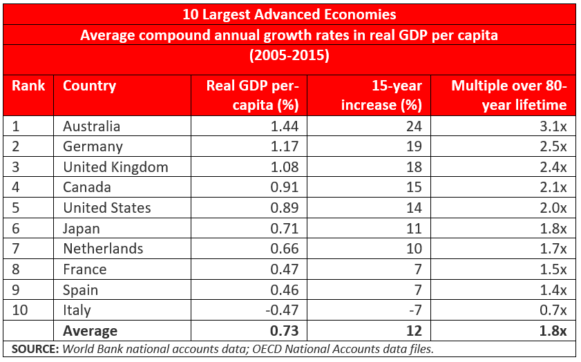
Note that the United States and Japan are together right in the middle of the pack, fifth and sixth, respectively, bracketed by Canada and the Netherlands. Three other countries achieved substantially higher real growth rates when measured per person, and three were substantially lower, including Italy, whose growth rate was negative. Among the 10 countries, the average growth rate was 0.73 percent per year, in between the United States and Japan.
The table also shows how much aggregate difference there is as the growth rate compounds for 15 years. At Australia’s leading 1.44 percent average growth rate, aggregate product per person increased by 24 percent in 15 years. The comparable number for the United States is 14 percent. France and Spain are half that at 7 percent and Italy is a 7 percent decrease.
The effects of differences in compound growth rates are always impressive if they continue over a long time.
We calculate what the aggregate increase in average economic well-being would be if the growth rate in real per-capita GDP could be sustained for a lifetime of 80 years. Australians would become, on average, three times better off during their lives; Canadians, Americans and Japanese about twice as well off. Spaniards would be 40 percent better off. In the long view of the millennia of human history, this is very impressive.
Of course, if the growth rate in real per-capita GDP could be 2 percent, these numbers would be much more impressive yet. Then, in an 80-year lifetime, the average economic standard of living would quintuple.
Homeownership Rates: It depends on whether you are married
Published by the R Street Institute.
The attached piece originally appeared in the Autumn 2016 edition of Housing Finance International.
American political rhetoric endlessly repeats that homeownership is part of the “American Dream.” So it is for most people, especially if you are married, as we will see.
As part of promoting this “dream,” the U.S. government has for many years created large subsidies for mortgage borrowing and huge government-sponsored financial institutions to expand mortgage lending. Most notable among these are Fannie Mae and Freddie Mac, which notoriously went broke in 2008 while following the government’s orders to make more so-called “affordable” loans, and survived only thanks to a $189 billion taxpayer bailout.
Fannie and Freddie are still massive operations, featuring a combined $5 trillion in assets (that’s trillion with a “T”), equity capital that is basically zero and utter dependence on the credit of the U.S. Treasury.
Given these massive and extremely expensive efforts, how has the American homeownership rate fared? Let us look back 30 years to 1985, and compare it to 2015. Thus we can go past the housing bubble and collapse of the 2000s, as well as past the financial collapse of the savings and loans in the late 1980s, and observe what has happened over a generation.
Read the rest.